Sunday, 1 May 2011


Friday, 22 April 2011
Wish you were here!

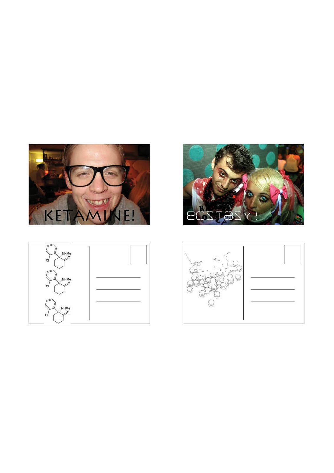
..:::....::.My Drug induced friends all wish you were here, or there, or wherever they are...
I wanted to turn the traditional postcard on its head so i started working backwards.
I thought of what a traditional postcard tells us? It a romanticised image, partly for advertising the tourism industry and party to tell, whoever it is they're sending it to, that here is much better than there.
So i thought about putting those in reverse, a statement that says "don't come here" and "there is much better than here".
but that would simply give me a rainy day, or a area of the world i simply would not want to go, but the problem is I already know I don't want to go there. with world news coverage we know where we don't want to go and places we do.
So i then thought about places we've been tempted to go to at some point, but wouldn't go to for whichever reason. I looked at Places and landmarks, spoke to some people but the only thing I'm coming up with are places like Afghanistan and Iraq. Which, to me, is like my first idea. So I had to divert away from places and I came into state of minds. Drugs.
I cannot vouch for everyone but some have ventured into the world of drugs. It's overly glamorised with people acting like idiots but with a huge grin on their face!
So i went out and spoke to some people i know who take drugs. the impression i got is that they make you feel brilliant for a short while but then you don't feel so great.
I took a few pictures of them on drugs but some were not so happy for me to put this on my work so unfortunately some of the images above are not people i've met on the drug. The whole situation was quite shocking really, and slightly surreal and comical. i decided to try and portray this in the text that I used.
Originally i wanted to then turn this into a 7 deadly sin's idea but, for me, these images really sum up the whole experience so i decided to keep them as they are::..:::..::......
Iconoclastic Plastic (Idea 2)

...::.:...:::::..My second interpretation of 'Icon' was:
3. One who is the object of great attention and devotion; an idol: "He is ... a pop icon designed and manufactured for the video generation" (Harry F. Waters).
I did some research into Idol's. I looked at Pop Idol, Album Covers, Worshipped figures, Christian paintings and other religions. But one that caught my eye and especially as it is a new political motion is the Obama 'Hope' Poster:

I really like this poster so id decided to base my coffee cup around this idea. All done in photoshop it took a few hundred attempts to get this right but eventually I think I did okay.
The reasoning behind the coffee cup and Obama was that America has this minor obsession with Coffee and with Obama supposedly bringing 'hope' to a new America the same can be said with coffee. First thing in the morning it bring's hope to everyone who is feeling tired..:::..::..
Iconoclastic Plastic

::..:.....::::How to turn an everyday object into an icon? Well the first hurdle was to define an icon, or iconography!
This is what i found:
i·con (
 k
k n
n )
)
kn)n.
1. also i·kon (kn)
kn)a. An image; a representation.
b. A representation or picture of a sacred or sanctified Christian personage, traditionally used and venerated in the Eastern Church.
2. An important and enduring symbol: "Voyager will take its place ... alongside such icons of airborne adventure as The Spirit of St. Louis and [the] Bell X-1" (William D. Marbach).
3. One who is the object of great attention and devotion; an idol: "He is ... a pop icon designed and manufactured for the video generation" (Harry F. Waters).
4. Computer Science A picture on a screen that represents a specific file, directory, window, option, or program.
Really it was just a situation of pick one of the above. I decided to go with pick 2 of the above.
the first one is the image shown^, i used an Iphone app icon and based my coffee cup around that iphone app. the reason for the cup is that it is so commonly used an an everyday object. It was the first thing that came to my mind when i first read this brief, it was the first example given by Ed and was one of the first images to appear on a google search.
Using illustrator i drew my representation of a coffee cup. I then moved over to Photoshop to create the shiny button itself and simply imported the vector over. I actually made 2 designs for this. The first is the larger image at the top. This was simply to fill the page, and then i made the smaller ones below. This was because the rounded corners matched the actual iphone app shape so it had to be made smaller. Imported them all over to Indesign and the final product is complete:.........::
Feature Shop
::..:.....::::Each film that was pitched, only 3 of them were to be chosen to make a short piece on during the day. Our's was about a girl who fell in love with another guy...not particularly original. I was chosen and the lead guy. Please note I do not act::..:.....::::


Wednesday, 30 March 2011
Ereda Project

::..:.....::::This is an art worked piece to go in my portfolio for the Ereda Project. Using Indesign I took screen shots of some scenes and put them together::..:.....::::
Brick

::..:.....::::100 uses for a brick, illustrate them on A2....pretty simple really I wish I would have gone over everything in illustrator but I didn't so I think I'm going to have to re do this in my own time::..:.....::::
Ereda Project
::..:.....::::This is simply Ahmad and myself recording ourselves drawing portraits of members of the public in Trafalgar Square.
The project was given after an awkward previous lesson where Ed and Dan felt that none of us were inspired by any of the work they were giving and so not giving 110%. This crossed with some members of our Group consistently not bringing in work, complaining about the work and arguing with Ed and Dan about the projects and how they found them 'boring'. Welcome to the real world! unfortunately for them they have yet to realise the world does not owe them a living and not everything is fun, fun, fun!
Anyhoo we were all to go away for a few hours and come up with a 'Dream Project'. It was to be achieved within a week and so I came up with an idea to re-design the 404: file not found page. I would then take everyone's work and put them on a domain page and each person work would rotate around.
I did think this was not quite up to the expectations of 'Dream Project' but thought it was a good idea at the time.
The piece of work that was actually chosen was by a girl named Ereda who said we should pair up, head into a busy location and document ourselves drawing people::..:.....::::
Mile High Type Club

::..:.....::::The day we received this I went into Leicester square to speak to the cinema's directly about putting my letter onto a cinema screen. I firstly went to Odeon, the Vue, then Prince Charles, then Pheonix in Mile end. Each member of staff i spoke to behind the counter said no it was not possible. Alas, i persisted and i got e-mail addresses for the guys at Prince Charles, IMAX and Odeon.
Odeon were quite happy to help but said i was not allowed to use there projector but i can use the screen and room for as long as i need. Unfortunately i did not have several thousands of pounds worth of cinema projector just hanging around.
IMAX were quite helpful seeing as i simply e-mailed them using there website and were quite quick to respond. They liked my idea and were happy to help and referred me to a projectionist who then told me they were too busy and unless i had the right image, on the right film (15X75mm) on a whole roll then I would not be able to do it. but i had a stroke of luck with a friend who used to be a projectionist in the IMAX at the Science Museum. After speaking to him he managed to get me in contact with the main projectionist, he did have some film that i could borrow but the only hurdle was that it was only a short segment of film and we needed the whole thing otherwise it will burn through the screen material.
During this time i had been in contact with a lady called Amanda at the Prince Charles. She was incredibly helpful and asked me (after 8 days of e-mails explaining what i wanted to do) to send her over the image i am looking to project. I emailed her over this image but because it was fairly small, to bring it 23ft big pixelated the letter quite badly.
So I went to Illustrator, opened a 10ftX10ft canvas and traced over the letter, expanded it to the size of the canvas and re sent it to her and it fitted perfectly!
She invited me in on a Monday morning, helped me set everything up, got it on the screen and then said i am welcome to do what I want until 13:00 when the cinema opens.
Luckily this only took around an hour so it was a quick process::..:.....::::
Justin Beiber: No Fear

:::..:.:. Unfortunately, i'm not a belieber. Our project was simply Justin Beiber: No Fear.
When i first saw this i thought of the 'No Fear' logo. A brand that makes clothing for motocross (http://www.nofear.com/).
Now i could guess that most people would have thought of this, but, my thinking was everyone would think it was too obvious, and not 'out the box' enough. So i decided to do it anyway. It's a parody of the No Fear logo but with justin Beibers eyes:
 ::::..::..::.....
Anarchy in the UK (4)

:::..:.:.I actually nearly got arrested for this first image. also, they actually have a guy who stops people from taking photo's within council buildings. That's his entire job! Amazing....
I spent a lot of time running in and out of council buildings and being told to leave while taking sneaky photo's so i'm not entirely sure which building this is from but i think it's the housing benefit's office, or job centre.
Either way, the girls face explains it all:::..:.:.
Anarchy in the UK (3)

:::..:.:.The rear of the 12" album and the rear of the 7" single. I wanted to get people coming in and out of the hall on both sides of the 12" album so here you can see someone coming out and someone else walking in:::..:.:.
Anarchy in the UK (2)

:::..:.:.This is the front cover to the 12" album and the front of the 7" single:::..:.:.
Anarchy in the UK

:::..:.:.The big project everyone must have been waiting for? this is my promo poster for a theoretical band called'The Bureaucrats'...a band made to ensure that you do your job properly and the establishment always knows what's best. When making this cover I heard the term 'Bureaucratic' twice, apparently im not allowed to take pictures OF or IN council buildings. I did anyway.
I wish i could have put my experience into this image but unfortunately I couldn't.
this actually took a long time to get together. My first idea was a band with unconventional rock music....rubbish. So I went back and after some ideas and sketches i came up with 'Red Tape'. At first a band that was fighting out against the bureaucratic red tape and this new 'cushion culture' that England seems to have where if you have a small cold you serve 10 days off paid!
I liked this idea as it took by what I genuinely thought. I started off by setting on fire a small guitar amp (as the music was rock). However it still didn't have enough substance to it. After some more sketches and trials i decided that maybe im trying too hard with this as it is something i believe in. Maybe i should try something i know not much about?
Originally based around depression (sadistic i know) I came up with this new band, which at first were called 'The Dictators'. They forced policy and red tape on you and made you life a hell.I wanted the style to be this strange doom metal that i've heard before, but after a quick chat and some more sketches with friends, peers and my tutors I decided that, i'm on the right track, but not quite there.
In came 'The Bureaucrats'.....
My first design was a guy sitting at a desk all tied up in tape but for some reason, maybe it was the photo's, i didn't like it, it seemed unfinished all the time. So i used some images of Town Hall that i took in East Ham. The reason for the building is that it looks....horrible really. Most council buildings now are all refurbished and look quite new. this one was not! So with a few shots of the outside and bureaucratic chat with a council person i got these good shots.
I made them more dramatic in Photoshop then stuck them on Indesign. With a few tutorials on how to make a tape effect with a brush and playing around with a few free fonts i got the look i was looking for!
Egg?

:::..:.:.Which came first? Influenced by an image seen while at the Whitechapel gallery where a chicken was in a giant egg I thought it would be quite funny if the egg simply grew legs and walked off. But I have noticed another student has had the same idea as this, maybe he was eavesdropping my thoughts?........egg?:::..:.:.
My favourite dress

:::..:.:.Originally proven as quite a difficult project. I started by researching dressed my sister would wear. Turns out there's a lot of dresses she would wear. I then started on some preliminary sketches of a dress as I had no idea where I was going with it. After i found some fabric and made the dress it didn't really have a direction but luckily turned out quite well in the end:::..:.:.
100 Club

:::..:.:.I am now a member of the 100 club, I headed out and took 100 photo's of street signs, not very creative I know but I had 1 week! I know there's not actually 100 images no the above but on a separate page there is 100 images. When I went to put 100 street signs in 100 feet the looked terrible so in my own time I am making it a double page spread:::..:.:.
Holliday Havoc

:::..:.:.This was a brief over Christmas to do something you have never done before. Well, i decided this would be a good time to head out in a banana suit I bought ages ago and go to the pub! Unfortunately however, my friend who I asked to do the photo's was completely useless so so i have no other photo's of me buying the suit, unpacking it, trying it on, and generally being harassed by members of the public. Just the of me, looking very comfortable in the pub:::..:.:.
Research Must's

:::..:.:.20 of my favourite artists, Graphic Designers, photographers and Illustrators......so far.
Produced on Indesign with a little help from a friend:::..:.:.
Think Crime

:::..:.:.Design the perfect murder. That was it! So..... I went away and googled a perfect murder. What came up was pretty lame actually so went off and spoke to Mike who is currently CID metropolitan police. Apparently, to pull this off you need a million things to go right and you would have needed to know what you was doing from a very young age. For instance, if a weapon is found, they scan for print then check them on a database. If you remember when you were a child and you went on a school trip to the police station and you had your fingerprints done? well your now on the database...and you've been found. Trick is to stay away from getting any of your information on any sort of database. The main idea behind the fingerprint is because it solves something like 75% of crimes.
So I chose a fingerprint, not my fingerprint unfortunately but it is someone I know (see, wouldn't be a perfect murder if I used MY print), and wrote a small essay about how to commit the perfect murder. Using illustrator I used the 'text on line' tool and simply pasted the text over the lines I drew.
After speak to Ahmad the following crit he mentioned that it would be more perfect if I had :ERROR: messages around to stop people from knowing the perfect murder!:::..:.:.
Snow Joke

:::..:.:.Snow joke? This was pretty simple really...go make a snowman! so i made a his and hers in Clapham Common:::..:.:.
My Psyche

::::....:We were asking to write a short essay on ourselves. Easy for some. Then end of the day hit and we were told to go away and artwork what we've written. Now this had changed the life of an illustrator who studied in Southampton some year ago so my assumption is that hopefully someone in our class will have an epiphany, Whether they did or not I don't know but it was quite fun.
Now, i'd spent around 4 days coming up with idea and they were all crap! But I spoke to a friend on mine who is a psychology student in Nottingham and he was rambling on about something and i wasn't paying attention but then he mentioned the Rorschach test. I gave him the third degree about this and we sat down and make some small tests up of our own. Now the point of the Rorschach test is not to find out what they see but how quick they are to answer the question which is simply 'What do you see here...". It's a massively discredited way of analysing someone which is why it is not used any more but good fun. the 4 images you see above are the 4 images I answered best on. I saw (going left to right) a brain, butterflied chicken, cat's cradle and a comic style bat moving across the sky. This apparently mean im normal?
Girl

::::....::.:.::::...::.....:::..:.:.:.::::......:........::::....
 :::...:.........:The piece of work above is a response to the image shown on the left.
When I looked at this image I thought immediately of pregnancy in the 1950's.
The previous night I had watched part of a series by Steven Spielberg called 'Taken'. On that particular episode the main protagonist was issued with cigarettes to calm his nerves by a doctor who also stated that they were "good for you". Both of these idea's were spilled onto this work and I came up with the idea of drawing a modern cigarette packet with a foetus on the label instead of 'Smoking Kills'. This was also done on the basis that they has warped views of smoking in the 1950's, whether it was propaganda or plain ignorance I wanted it to look like the cigarette brand was promoting pregnancy or making a statement that smoking will help you get pregnant. Which of course, it wont.....:.:........::
Wing of a Bee

::..:......::My first attempt with Illustrator! Not a particularly successful one and took ALOT longer than I expected, but it wasn't simply the time taken to do it, i was having to learn the programme too. the below image is a hand drawn image on A2. It's all completely random so I wouldn't be able to go into too much detail about the image itself. The above image is the illustrator version or vector image. I did actually cheat on this, despite Ed and Dan's disapproval over using 'Live Trace'. I actually did it to save time as we had a week to do it and it took me 5 days to get about half way and it had to go to print that day to be ready for Thursday morning.
But i managed to squeeze out most of it using the pen tool but unfortunately i had to send it to the printer by 5pm so i had to keep the lines within the small circles to the right as they were as i ran out of time::..:......::

Excuses 1

::..:......::Ed was not in today either and the reason for it? "I'm sorry but I am shooting a commercial for Sony". Which lead to this project...excuses. We had to come up with an excuse of our own!
Now as we were doing narratives in Illustration, my previous work with comic I decided to stay on the same road but experiment with typography now! This project actually ran quite smoothly in the sense that my first idea actually received positive feedback from both Dan and my peers. Although my original piece did not look like a comic book effect, but more like a comic book font spliced with a western theme....which did look good but sadly it was not enough. So i came up with the idea of putting into small boxes, the same way as they do in the comic's. I attempted with 5 boxes, each with it's own word but unfortunately as some words were longer than others it did not give me the impact i wanted. So i decided to break the words up a bit into several boxes. This did look better but it still did not look like enough.
After going through some more comic's I just couldn't find any inspiration for it until i came across a Graphic Novel. Now unlike the comic's i'd been reading, the first letter of each chapter overlapped the drawing canvas and spilled onto the whites of the page. This gave the page so much more feel and danger. So i adopted that and put into into my work and hey presto!
Although this is a little hard to read due to the words breaking up. The colour used was with a posca pen, or pens. These had a great vibrant colour which i could use and the effect of paint gave it more of a feel to it::..:......::
Song Bloggie

::..:......::Our Tutor, Ed Gill, was away this week directing a new advert for Sony called the 'Bloggie'. Which is basically an iphone without the phone for Sony. We were told to come up with our own advert idea.
After some research into this new gadget i found that it's main target audience was for this was the same as the target audience for social networks, so were looking around the 16-34 range. Being a new 'gadget', to me this would appeal for to the tech freaks and younger generation more than anything so i decided to go with a anime/comic style advert. Now although this is in paper form and set out similar to a comic i would love for this (if it was to go on TV) to be filmed in a comic book meets real life style. Think of 'Sin City' and 'Scott Pilgrim vs The World'.
However as this was on paper form, i had to lay it out like a comic. It starts off with someone running away from a gang, he gets lost and cornered on some stairs but find's what appears to be a phone. Brilliant! this will help! but when he picks it up he turns into some sort of super human. fighting off the gang he decides that simply beating them up is not enough so with his giant camera on his chest he decides to put it to good use and photographs the gang which is sent to the police. The police arrive and the song bloggie saves the day!
Upon reflection this is probably not the best advertisement for teenagers but, gladly it's not going on TV::..:......::
Pay to Play

::..:......::Our 1 day project, our task was to re-design the pound coin to reflect the current economical climate. My idea was that our newspaper are constantly informing us that our budget is tight, disposable income has been reduced and we are being 'Squeezed'. The above image is a standard pound coin being squeezed and the image below is to represent another chart, one of many we are being exposed to recently to indicate that a chunk of our economy is missing::..:......::
Meet me on the corner

::..:......::We were asked to meet at Trafalgar square for the briefing for this, which was more of a treasure hunt than anything else and at each destination we had a certain task whether it be to draw something, pick something up or take a photo. Here is my indication of the day, i drew a rough illustration of a part of London on the river and stuck all the pieces that i collected that day in the areas of London i did not visit, in this case it was the south side of London::..:......::
Brand me up Buttercup!

::..:......::This is a branding project. We were paired up with someone else from the Group and asked to find out as much information we could about them and then brand them with a logo.
I was paired with Miles Creevy. After some time finding out as much as I could about him and doing some small sketches next to the information I came up with this. I did have a few images i did before hand but after asking what people thought of them they didn't give the right impression, one of them reminded him of the 'Miramax' logo. So this is the final draft.
the point behind this is a giant 'M' in a graffiti style font (although this actually looks more heavy metal than anything else) and it incorporates a backdrop of Singapore which he spent 3 months. It also incorporates a space invader to represent video games, a tape for music and a bmx rider coasting the side of the 'M' to show he's likes extreme sports::..:......::
Too Much Tolkein

::..::....:.:.:::We were informed that "To broaden your creative mind" we must read a book, or a classic. Now as i've read about half already and the other half are about the American depression i decided to read 'The time travellers wife'. As evidence of this here is an image of me half way through he book::..::....:.:.:::
Subscribe to:
Posts (Atom)